The Lighting Design Process
There’s a process that every seasoned Lighting Designer goes through as they wrap their head around a new set of architectural drawings. For me, architectural lighting design is a holistic endeavor, where I plumb the depth and breadth of information conveyed through the plans, ponder considerations that have been overlooked, and draw on my extensive design vocabulary. Once I become focused on a notion, or geometric shape, I might continue to explore the theme again and again, over some number of sequential projects. For example, when I was in my late twenties, I spent a few years working with The Circle: how many ways might it be interpreted, or expressed, in physical structure and/or in light; whether it is woven into a large space or condensed into a smaller one, perhaps by the beams in space; by cascades tertiary-to primary colors, or by the fixtures’ mounting positions, etc.
Fluidity of thought… evolution of emotion… this IS the heart of the art. As my mentor often said, “We’re the magicians because we know where to put light, and where to take it away.”
Function and Form: Lighting Artwork
However, not every design project is an opportunity for an evolution of one’s art. Certain design challenges can be boiled-down to simple nuts and bolts solutions. Take the matter of lighting artwork in the residential setting. There are tried-and-true solutions, so why recreate the wheel?
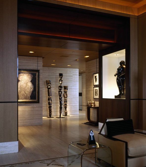
In the picture above, the artwork lighting thoroughly illuminates the gallery space, yet without spillage all over the walls. The art is glowing and shadow sparingly applied. My tools were the trusted and true recessed down light and adjustable accent light.
Recessed Niches
Recessed niches are challenging. Depth, width and height all must be factored. Is the art object proportional to the niche, leaving you with enough space to work your magic? Is the object opaque or, perhaps, translucent? Is it highly reflective, or matte finish? Do you wish to light the entire, recessed niche, or primarily focus on the object itself? The physical construction of the niche needs to be determined well in advance. Be sure that there is space for your fixtures, whether they are above, below or around the perimeter, if you wish to utilize linear LEDs.
Sculpture
Free-standing sculpture in any residential space might be viewed from many different vantage points, so the matter of glare should be considered. Side lighting does wonders for sculpture, just as it does for dancers onstage, but there must be a place to dump the excess light. If you haven’t got it in the interior space plan or architecture, then don’t attempt it. Try to sculpt the statuary from multiple, high-angle lighting sources, so that the floor ~ not the patron ~ is catching the spillage.
Framed Art
Flat art has its challenges, but there are some tried-and-true solutions that are easy to implement. One of those, of course, is the picture light. There are many manufacturers of this kind of product, but not all are equal. Consider, please, the width of the picture light to the width of the canvas, and to the overall width of the painting within the picture frame. Yes, light will spread outward and downward from any cylindrical picture light, but will you also be lighting the frame itself? A thirty nine-inch portrait width, surrounded by a three-inch, heavily-sculpted picture frame, sits on the wall… Does a twenty four-inch wide picture light work coherently with these other two dimensions, or would a thirty nine-inch wide cylinder make more visual sense? You might be able to remove the first and last two inches worth of lamps to better tailor the spread of the light across the canvas, thus controlling overthrow. This is where custom fixtures give you great control over beam spread, proportions, and finishes.
How far away should that picture light be from the canvas, itself? Well, 30 to 35 degrees of attack angle is acceptable, but you need to clear the depth of any heavy, built-out frame above the canvas, or you’ll wind up casting its shadow down the canvas. Another consideration is the texture of the artwork, itself. A black and white photograph is truly flat, whereas some pointillist or Neoclassical canvas can have intrinsic texture that, itself, can be shadow-casting if lit from too steep an angle. Once again, this meticulous finessing of light is best suited for custom picture lights or, perhaps, from recessed framing projector fixtures mounted in the ceiling. If you should go this route, then you must still maintain the angle of approach, so pay special attention to the ceiling height!
There’s Something Above the Sheetrock
There are a myriad of choices for this lighting technique: a variety of lamp beam spreads, textured or striated glass filters, and semi-adjustable metal beam shapers. However, regardless of the lamp and where you choose to place the luminaire, there are many situations when the best choice isn’t possible.
Before you promise the client they’ll have museum quality recessed lighting on their artwork, you must be certain of the plenum height. A five inch tall fixture won’t fit into a four inch deep space. Where is the duct work, the sprinkler pipes, the structural members (wood or steel) that hide above the sheet rock ceiling? Also, confirm that the attack angle won’t be too steep, or too shallow. Double check these crucial details before you order the lighting fixtures.
Track Lighting: A Last Resort
I consider track lighting to be a last resort because the hardware involved is so obvious, intrusive, and style-driven. Light is ephemeral magic; fixtures are hard objects.
But if the ceiling plenum is full of duct work and sprinkler pipes, then utilize track lighting products. Typically, track can be recessed, surface-mounted or suspended, and comes wired for single-circuit or multiple circuits. The range of track heads are varied to accommodate different lamps and accessories, like frosted glass, linear diffusion glass, etc. Some heads can zoom the beam, or shape it into rectangles and squares, by means of sheet steel planes that, when adjusted, move into or out of the light beam.
Conclusion
This case study of how to artfully apply a timeless technique of lighting artwork is dedicated to the next generation of lighting students, end-users, interior designers, art collectors, and others who have had little practical experience with lighting artwork. I would implore you to adopt an inquisitive nature; find out what’s in the ceiling and you will short circuit on-site frustration and client drama, and ensure the desired effect.
Many thanks to Chicago-based interior architect Scott Himmel, who designed this upscale residence, provided the image, and brought me on board as lighting consultant. Photo by Scott Frances.
++++++++++++++++++++++++++++
About Mark D. Kruger, Architectural Lighting Designer
Mark has added his painterly sensibility of light, materials and space design to some of the most iconic places in the world, including the infamous Studio 54, The Kremlin compound of Karzan Tartarstan, the first and largest themed restaurant, Boogie’s Diner, and the cutting edge retail showroom of Willi Smith.

